
Instead of sending a user to one “best” page, Google’s AI Mode assembles an answer from short text extracts (snippets) taken from multiple sources on the first results page. Our study compares those extracted snippets with their full source pages and checks where in the SERP those sources sit.
AI tends to rely on several page-one results at once; the supplied snippets are often more on-point for the query than the broader page; and sheer length of a page doesn’t make it more likely to be used. Because the model pulls from many page-one listings, a result sitting in position ten can still be surfaced alongside position one inside the same AI answer.
The piece frames this as a shift in distribution: what gets seen by the model (a tight, representative passage) matters as much as the overall page, and “page one” functions more like a pooled source list than a ranking podium.
Semantic Retention in LLM Grounded Search: An Empirical Study of Prompt–Snippet–Page Alignment
Abstract — We analyze 213 model responses comprising 1,394 snippet–page pairs to quantify how well retrieval “snippets” align semantically with user prompts compared to their source pages. Using embedding-based cosine similarity, snippets are, on average, more aligned with prompts than the full pages they come from (Δ = cos(p,s) − cos(p,g) = 0.0247, 95% CI [0.0219, 0.0276], t = 16.91, p = 8.79×10⁻⁵⁹; Cohen’s d = 0.453). Alignment remains largely stable as the number of retrieved sources increases (Pearson r between N and mean cos(p,s) = 0.045). Relevance is concentrated: the median top‑1 similarity share per response is 0.172, and a median k = 5 top snippets cover 80% of cumulative prompt↔snippet similarity. Diff‑based residual analyses were excluded due to instability. Results support retrieval settings that emphasize top‑k snippets (≈5–7) and snippet‑level scoring for reranking and summarization.
1. Introduction
Systems that cite grounding sources often surface short “snippets” from web pages. Whether those snippets faithfully capture the prompt‑relevant content—and how that changes with the number of sources—matters for both user trust and summarization quality. We evaluate semantic retention using embedding-based similarity over a mined dataset of prompts, snippets, and source-page texts. We exclude a separate LLM diff–tagging experiment due to reliability concerns.
2. Data and Pipeline
Prompts were mined via a search‑tool workflow that stores raw model outputs and parsed snippet sources in a local SQLite database. Pages were fetched and cleaned, yielding prompt–snippet–page triplets for analysis. Embeddings were computed with google/embeddinggemma‑300m and cosine similarity was used for alignment metrics. Full workflow and metric computation are implemented in the analysis app and embedding utility; the raw miner app populates the database. app embed miner
Dataset used in this study.
- Responses: 213
- Snippet–page pairs: 1,394
- Excluded: LLM diff feature (instability; not used for any result)
3. Metrics
Let p be the prompt, s a snippet, and g its source page. We compute:
- cos(p,s): prompt–snippet similarity.
- cos(p,g): prompt–page similarity.
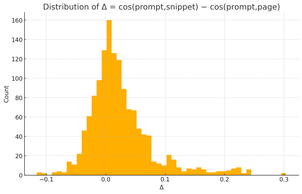
- Δ = cos(p,s) − cos(p,g): per‑pair snippet advantage.
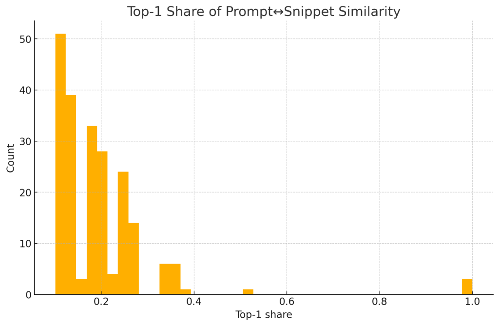
- Per‑response top‑1 share: max cos(p,s) divided by sum of cos(p,s) over snippets.
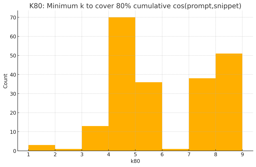
- Per‑response k₈₀: minimum k such that the top‑k snippets (by cos(p,s)) reach ≥80% of cumulative similarity.
4. Results
4.1 Snippets vs pages (paired)
- Mean cos(p,s) = 0.7171 (95% CI [0.7146, 0.7195])
- Mean cos(p,g) = 0.6923 (95% CI [0.6889, 0.6957])
- Δ = 0.0247 (95% CI [0.0219, 0.0276]) over N=1,394 pairs
- One‑sample t‑test on Δ>0: t = 16.91, p = 8.79×10⁻⁵⁹
- Wilcoxon signed‑rank on Δ>0: W = 723,205, p = 2.55×10⁻⁵⁶
- Effect size: Cohen’s d = 0.453 (moderate)
Interpretation. Snippets are consistently more prompt‑aligned than their source pages. The effect is statistically decisive and practically non‑trivial.
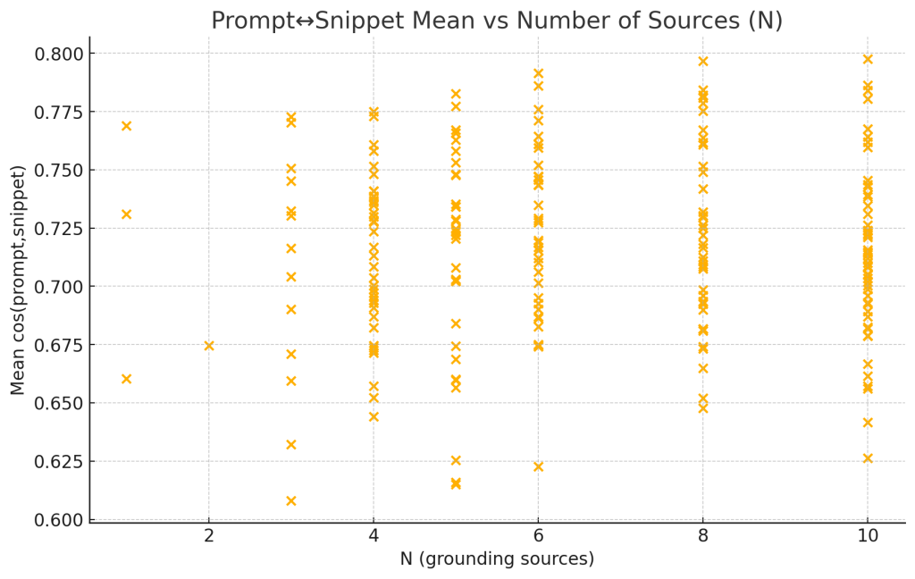
4.2 Alignment as a function of the number of sources
- Correlation N ↔ mean cos(p,s): Pearson r = 0.045; OLS slope +0.00072 per additional source (intercept 0.7117).
Interpretation. Increasing sources does not erode average snippet alignment; the relationship is near‑flat.
4.3 Relationship between snippet and page alignment
- Across responses, snip_mean and page_mean are positively correlated (r = 0.691).
Interpretation. Prompts that elicit more aligned snippets also tend to have more aligned pages, as expected; however, snippets still exhibit a reliable advantage (Δ>0).
4.4 Concentration of usefulness (dominance) and top‑k coverage
- Median top‑1 share of cos(p,s): 0.172 (IQR 0.124)
- Median k₈₀: 5 (minimum number of top snippets to reach 80% cumulative similarity)
Interpretation. A small head of highly aligned snippets dominates. Roughly five top snippets suffice for most of the achievable alignment signal.
5. Practical Implications
- Favor snippet‑level scoring. Since snippets outperform pages on prompt alignment, rank and summarize primarily from snippet signals, not page‑global signals.
- Top‑k budgeting. Given k₈₀ ≈ 5, retrieval/summarization pipelines can often cap aggregation at 5–7 high‑quality snippets with minimal loss in prompt relevance.
- Stable with more sources. Adding sources does not, on average, wash out alignment. Systems may safely retrieve broader pools for recall but should selectively summarize.
- Reranking focus. The concentration of usefulness (top‑1 share ≈ 0.17 median) supports learning‑to‑rank or re‑routings that pay extra attention to the best‑matching snippet per query.
- Monitoring. Track Δ and k₈₀ as health metrics. Rising k₈₀ or falling Δ can indicate retrieval drift.
6. Limitations
- Embedding proxy. Cosine similarity of a single embedding model approximates relevance; it is not a ground‑truth measure of factuality or completeness.
- Topical and query diversity. The dataset aggregates heterogeneous prompts; topic‑specific effects are not segmented here.
- Excluded diff analysis. Residual‑text diffing was omitted due to instability; these results reflect embedding‑based retention only.
7. Conclusions
Across 213 prompts and 1,394 snippet–page pairs, snippets are systematically closer to the prompt than their full source pages, with a moderate effect size and overwhelming statistical support. Alignment scales neutrally with the number of sources, while usefulness is concentrated in a small head: about five top snippets capture most of the alignment signal. These findings justify retrieval strategies that (i) privilege snippet‑level scoring, (ii) summarize from a compact top‑k set, and (iii) monitor Δ and k₈₀ as operational quality indicators.
- Analysis of grounding context snippet generation.
- Google’s AI Mode content fetching mechanisms.
The Visual Guide
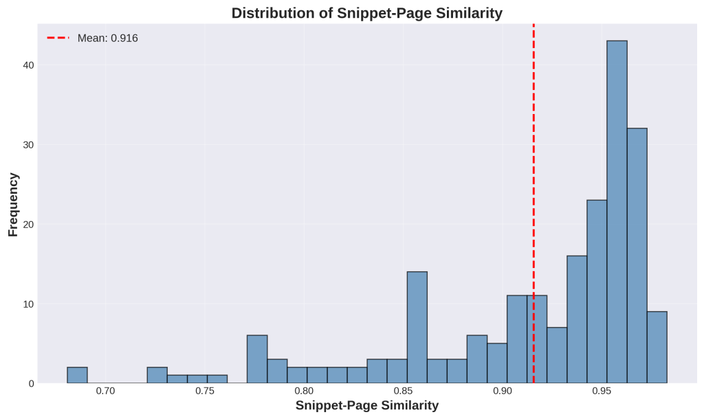
Chart 1: Distribution of Snippet-Page Similarity
1. What is this
This is a histogram showing how well snippets represent their full source pages. The x-axis shows similarity scores from 0 to 1 (where 1 is perfect match), and the y-axis shows how many queries fall into each range. The red dashed line marks the average at 0.916, meaning snippets capture 91.6% of their source page’s meaning on average. Most bars cluster on the right side, showing high similarity.
2. How it was generated
Data: 213 queries from your aggregate-level CSV file.
Process:
- For each query, we took all the snippets Google returned
- We calculated how similar each snippet was to its full source page using embeddings
- Embeddings are mathematical representations of text created by Google’s embedding-gemma-300m model
- We used cosine similarity to measure how close the snippet’s meaning is to the page’s meaning
- We averaged these scores for each query
- We plotted all 213 average scores as a histogram
3. What do I do with this information
If your data shows high similarity (most bars on the right, above 0.9): Your content structure is working well. Google can extract representative snippets from your pages. Keep doing what you’re doing.
If you see scores below 0.8: You have a problem. Your snippets don’t accurately represent your pages, which means:
- AI might misrepresent your content when citing you
- Your pages cover too many unrelated topics
- Your content structure needs fixing
Action: Find the pages with low representativeness scores (bottom 20%) and audit them. Look for pages that jump between multiple topics or bury important information. Restructure these pages to have clear, focused sections.
Chart 2: Prompt vs Snippet Similarity
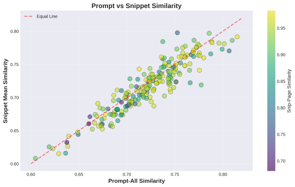
1. What is this
This scatter plot compares overall search quality to snippet quality. Each dot represents one query. The x-axis shows how well the entire set of search results matches the query. The y-axis shows how well just the snippets match the query. The red diagonal line represents “equal performance” – dots above the line mean snippets perform better than overall results. Colors show snippet-page similarity (yellow = high, purple = low).
2. How it was generated
Data: 213 queries from your aggregate-level CSV file.
Process:
- For each query, we calculated similarity between the query and all search results combined (x-axis)
- We calculated similarity between the query and just the snippets (y-axis)
- Both calculations use embeddings (mathematical text representations) and cosine similarity
- We colored each dot based on how well snippets represent their source pages
- We added the diagonal reference line to show where snippet performance equals overall performance
3. What do I do with this information
If most dots are on or above the diagonal line: Your snippet extraction is working well. Snippets are as good as or better than full results for matching queries. This is ideal for AI visibility.
If many dots fall below the line: Your full search results are better than their extracted snippets. This means:
- The extraction is choosing the wrong sections
- Your best content isn’t in easily extractable locations
- You need clearer structure (H2/H3 headings) to help extraction work better
Action: For queries where dots are far below the line, identify which pages were returned. Check where the most valuable content is located on those pages. Restructure to move key information to the top or into clearly marked sections with descriptive headings.
Chart 3: Distribution of Snippet Counts per Query
1. What is this
This bar chart shows how many snippets Google typically returns per query. The x-axis lists the number of snippets (1 through 10), and the y-axis shows how many queries returned that count. You can see most queries return either 4, 8, or 10 snippets. Very few queries return just 1-3 snippets. The average is 6.5 snippets per query.
2. How it was generated
Data: 213 queries from your aggregate-level CSV file.
Process:
- For each of the 213 queries, we simply counted how many snippets Google returned
- We grouped queries by their snippet count
- We plotted the frequency of each count as bars
- This is straightforward counting – no complex calculations needed
3. What do I do with this information
This fundamentally changes SEO strategy. Google shows Gemini multiple snippets (average 6.5), not just the top result. This means:
- It’s not winner-take-all anymore
- Multiple sources contribute to AI answers
- Position 2-10 have real value now
- You don’t need to rank #1 to get AI visibility
Action: Stop obsessing over position 1 for every keyword. Instead:
- Target clusters of related long-tail queries where you can rank page one
- Build multiple focused articles on related topics instead of one massive article trying to rank #1
- Accept positions 5-8 as valuable AI visibility opportunities, not losses
- Focus on being “one of the good sources” rather than “the only source”
Chart 4: Snippet vs Page Similarity Comparison
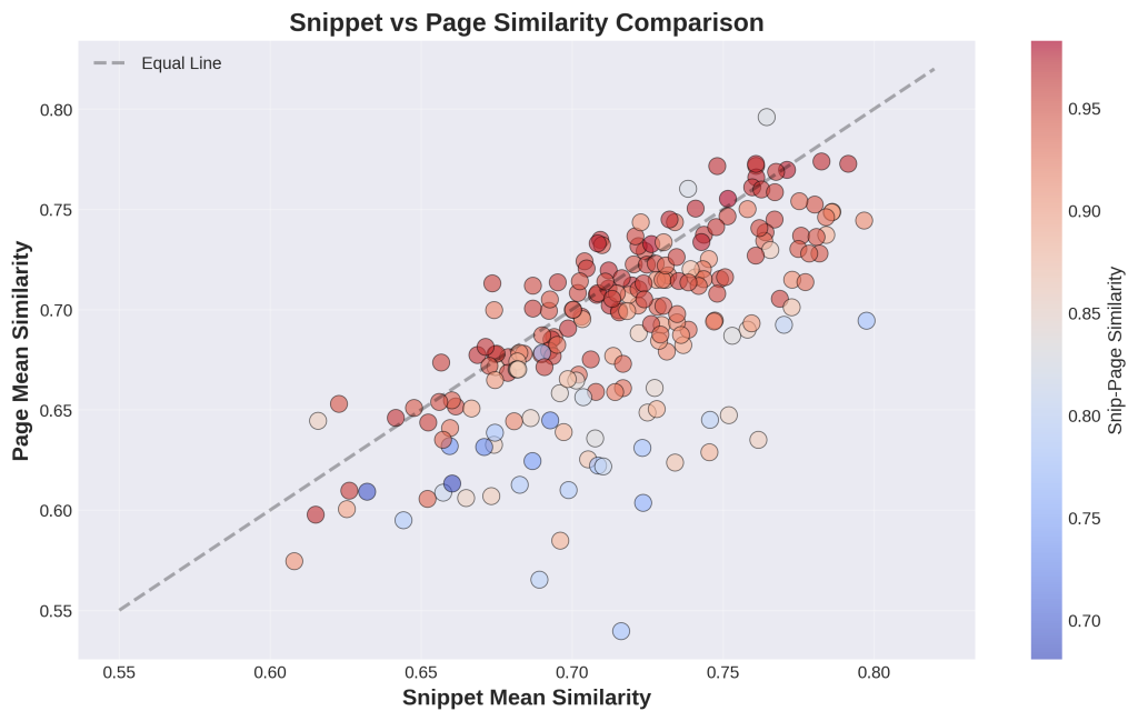
1. What is this
This scatter plot directly compares snippet quality (x-axis) to full page quality (y-axis) for each query. Each dot is one query. The black diagonal line means “equal quality” – dots above the line mean full pages performed better than snippets, dots below mean snippets performed better. The colors show snippet-page representativeness (red = high, blue = low). Most dots cluster along or below the diagonal.
2. How it was generated
Data: 213 queries from your aggregate-level CSV file.
Process:
- For each query, we calculated average similarity between the query and all snippets (x-axis)
- We calculated average similarity between the query and all full pages (y-axis)
- Both use embedding-based cosine similarity measurements
- We colored each dot by how representative the snippets are of their pages
- We added the diagonal line as a reference for equal performance
3. What do I do with this information
Dots below the line (snippets win): Your extraction is adding value by focusing content. The snippet is more relevant than the bloated full page. This is good.
Dots above the line (pages win): Full pages are more relevant than their snippets. This happens when:
- The query needs information from multiple page sections
- The best content isn’t in extractable chunks
- The page has comprehensive coverage that gets diluted when extracted
Most dots should be red/orange colored: This means even when snippets are more focused, they still accurately represent the full page content.
Action:
- For dots far above the line: These pages have scattered information. Consolidate related information into clear sections.
- For dots below the line with blue/purple colors: These snippets outperform pages but don’t represent them well. Usually means the page covers too many topics. Split multi-topic pages into focused single-topic pages.
Chart 5: Similarity Quality by Number of Snippets
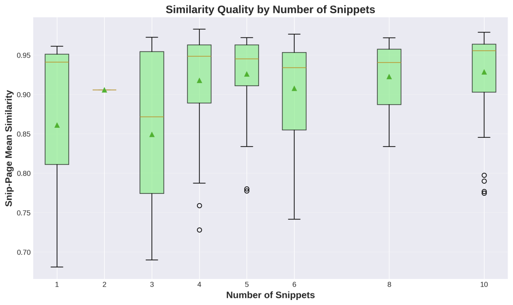
1. What is this
This box plot shows whether having more snippets per query hurts or helps quality. Each green box represents queries grouped by snippet count (1, 2, 3, etc.). The box shows the range of quality scores for that group – the line in the middle is the median, the box shows the middle 50% of values, and circles show outliers. The y-axis measures snippet-page representativeness from 0 to 1.
2. How it was generated
Data: 213 queries grouped by their snippet count.
Process:
- We grouped queries by how many snippets they returned (1 snippet, 2 snippets, etc.)
- For each group, we collected all the snippet-page representativeness scores
- We calculated statistical distributions (median, quartiles, outliers)
- We plotted these distributions as box plots
- The triangle marks show the mean for each group
3. What do I do with this information
Key finding: Quality stays consistently high across all snippet counts. More snippets does NOT dilute quality.
What this means:
- Google can safely show Gemini 8-10 snippets without quality degradation
- Multiple sources provide better coverage, not noise
- The AI benefits from diverse perspectives on the same query
For your content strategy:
- Stop fighting to be “the one answer” for a query
- Build topic clusters with multiple pages on related angles
- All your pages ranking on page one contribute to AI synthesis
- Embrace multi-source strategies instead of single-hero-page approaches
Action: Review your content strategy. If you’re trying to create one massive comprehensive article to dominate a topic, consider splitting it into 3-5 focused articles targeting related queries. Each can rank page one and contribute to AI answers.
Chart 6: Feature Correlation Matrix
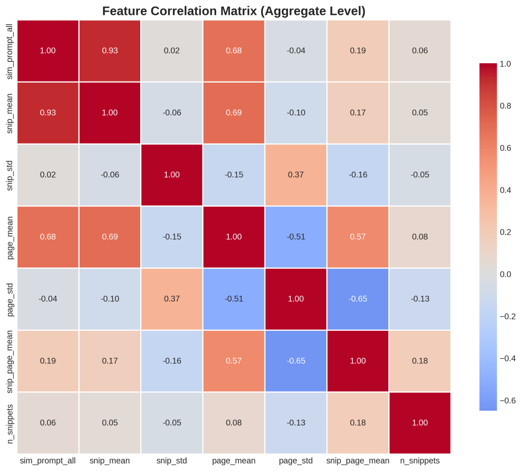
1. What is this
This heatmap shows how different metrics relate to each other. Each cell shows the correlation between two metrics. Red means positive correlation (when one goes up, the other goes up), blue means negative correlation (inverse relationship), white means no correlation. The numbers show correlation strength from -1 to +1. The diagonal is always 1.0 because everything correlates perfectly with itself.
2. How it was generated
Data: 213 queries with 7 metrics each.
Process:
- We took 7 key metrics: sim_prompt_all, snip_mean, snip_std, page_mean, page_std, snip_page_mean, and n_snippets
- We calculated Pearson correlation coefficients between every pair of metrics
- This measures how much two metrics move together
- We visualized the correlation matrix as a color-coded heatmap
- The matrix is symmetric – top-right mirrors bottom-left
3. What do I do with this information
Key correlations to notice:
sim_prompt_all and snip_mean (0.93): Strong positive correlation. When overall search quality is high, snippet quality is high. This is expected.
page_std and snip_page_mean (-0.65): Strong negative correlation. When page similarity scores vary wildly (inconsistent quality across pages), snippet-page alignment suffers. This tells you inconsistent pages produce worse snippets.
n_snippets and everything else (around 0.05): Almost no correlation. Number of snippets doesn’t predict quality. More is not better or worse.
What to do:
- Aim for consistency within each page – don’t mix high-value and low-value content
- Create focused pages with one clear purpose
- Don’t pad content with more snippets thinking it improves things
- Stop writing multi-topic pages that would have high page_std scores
Action: Audit your pages for topical consistency. Pages that jump between multiple unrelated topics or mix quality levels will hurt snippet extraction. Split them into focused single-topic pages.
Chart 7: Semantic Tension (Delta Distribution)
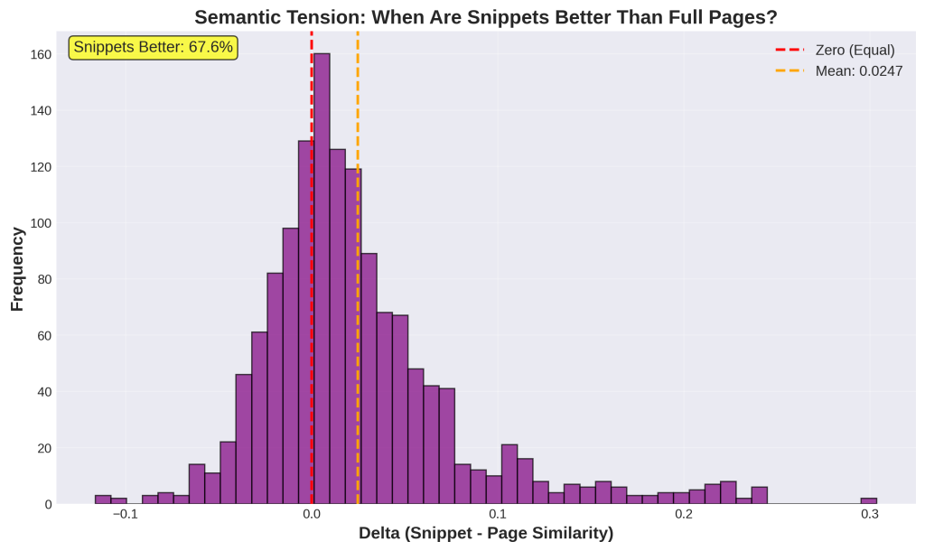
1. What is this
This histogram shows “semantic tension” – the mathematical difference between how well a snippet matches a query versus how well the full page matches. The x-axis shows delta values (positive means snippet wins, negative means page wins). The red line at zero represents equal performance. The orange dashed line shows the average delta of +0.0253. The yellow box highlights that 67.6% of snippets have positive delta (they outperform their source pages).
2. How it was generated
Data: 1,394 individual snippets from your granular CSV file.
Process:
- For each snippet, we calculated its similarity to the query using embeddings
- We calculated the full page’s similarity to the same query
- We subtracted: Delta = (snippet-query similarity) – (page-query similarity)
- Positive delta means the snippet is more relevant than the full page
- We plotted all 1,394 delta values as a histogram
- We marked the zero line (equal) and mean line for reference
3. What do I do with this information
This is THE critical metric for AI visibility. Positive delta means Google’s extraction is working – it’s pulling the most relevant parts and giving them to Gemini.
Why snippets win (67.6% of cases):
- Focus: Snippets remove fluff, ads, navigation, tangents
- Relevance: Extraction targets the most query-relevant section
- Coherence: Good snippets respect topic boundaries
For your content:
- Front-load value: Put your best content in the first few paragraphs
- Use clear structure: H2/H3 tags help define extraction boundaries
- One topic per section: Each section should be independently valuable
- Kill the storytelling intros: “Let me tell you about the time…” is death for AI
Negative delta cases (32.4%): The full page is more relevant. This happens when the query needs information from multiple sections or context from elsewhere.
Action: Audit pages with negative delta. Your most valuable content is probably buried mid-article or scattered across sections. Restructure to make your best content snippet-friendly (extractable as a coherent 200-300 word chunk).
Chart 8: Does Rank Position Affect Quality?
1. What is this
This line chart shows quality metrics across rank positions 1-10. The blue line (left y-axis) shows how well snippets match queries. The orange line (right y-axis) shows how well snippets represent their source pages. Both lines stay relatively flat across all positions, meaning quality doesn’t significantly drop from position 1 to position 10.
2. How it was generated
Data: 1,394 individual snippets grouped by rank position.
Process:
- We grouped all snippets by their rank position (1st result, 2nd result, etc.)
- For each rank group, we calculated the average snippet-query similarity
- We calculated the average snippet-page representativeness
- We plotted both metrics across ranks 1-10
- We used dual y-axes because the metrics have different scales
- The chart only shows ranks 1-10 for clarity
3. What do I do with this information
This changes everything about SEO strategy.
Traditional SEO: You MUST rank top 3 because click-through rates drop dramatically after that.
AI search reality: Positions 1-10 are nearly equal in quality. Google feeds all of them to Gemini.
The numbers:
- Position 1: 0.7164 relevance
- Position 5: 0.7076 relevance
- Position 10: 0.7018 relevance
- Quality drop: Only 2% (essentially negligible)
What this means:
- Position 7 now has real value for AI visibility
- You don’t need position 1 to contribute to AI answers
- Page-one presence is enough
- Competitive keywords where you rank 4-10 are now valuable
Strategic shift:
- Old: Fight for position 1-3 on high-volume keywords
- New: Secure page-one presence across multiple related queries
Action: Review all keywords where you currently rank positions 4-10. These are NOW valuable for AI citations (previously considered “losses”). Stop abandoning these keywords. Instead, invest in maintaining these page-one positions and add more related page-one rankings rather than fighting for position 1 on one keyword.
Chart 9: Does Snippet Length Affect Quality?
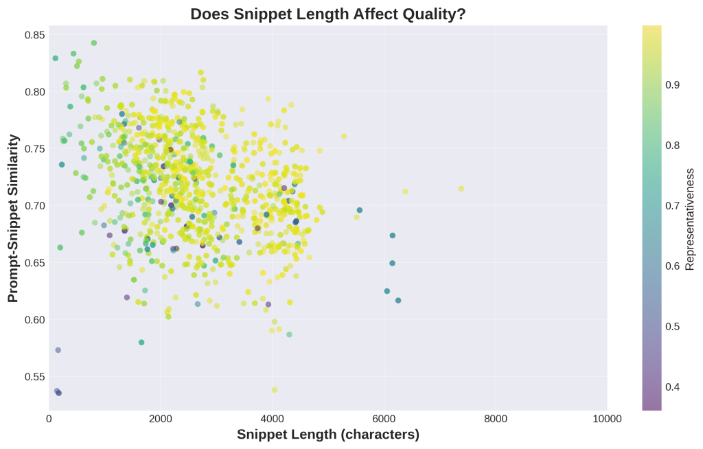
1. What is this
This scatter plot shows snippet length on the x-axis (in characters) and snippet quality on the y-axis (how well it matches the query). Each dot is one snippet. The colors show representativeness (yellow/green = high). If length mattered, you’d see a clear upward or downward trend – dots moving up or down as you go right. Instead, the dots are randomly scattered with no pattern.
2. How it was generated
Data: 1,394 individual snippets from your granular CSV.
Process:
- For each snippet, we measured its length in characters (x-axis)
- We measured its similarity to the query using embeddings (y-axis)
- We colored each dot by how well the snippet represents its source page
- We limited the x-axis to 10,000 characters for readability
- No trend line was added because there’s no meaningful correlation (r = 0.05)
3. What do I do with this information
THE BIG TAKEAWAY: Length doesn’t matter for quality.
The correlation between length and quality is 0.05 – essentially zero.
What this means:
- A 1,500-character snippet can be just as good as a 4,000-character snippet
- Short snippets aren’t worse quality
- Long snippets aren’t automatically better
- The “comprehensive long-form content” strategy doesn’t guarantee AI visibility
Why this matters:
- Stop padding word count to hit arbitrary targets (3,000+ words)
- A tight 1,200-word article can outperform a rambling 4,000-word guide
- Semantic density matters more than length
- Quality is about relevance and focus, not volume
What drives quality instead:
- Topical focus: Stay on one clear topic
- Query alignment: Match what users are actually asking
- Clear structure: Make extraction easy with headers
- Coherence: Each section should stand alone
Action: Audit your content strategy. If you’re writing long-form content just to be “comprehensive,” stop. Instead, write focused content that directly addresses specific queries, regardless of final word count. A focused 1,500-word article beats an unfocused 4,000-word article for AI visibility.
Chart 10: How Well Do Snippets Represent Their Source Pages?
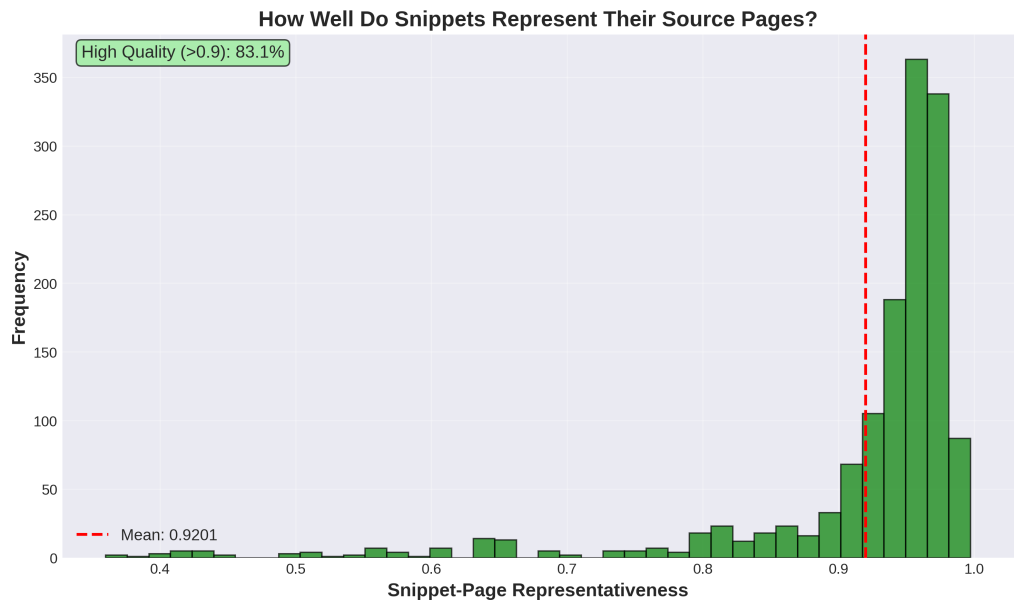
1. What is this
This histogram shows representativeness scores – how faithfully snippets capture their source pages’ meaning. The x-axis goes from 0 (not representative at all) to 1 (perfectly representative). The y-axis shows frequency. The red line marks the mean at 0.92 (92%). The green box notes that 88.7% of snippets score above 0.9. The distribution is heavily skewed left with most values clustered at the high end.
2. How it was generated
Data: 1,394 individual snippets.
Process:
- For each snippet, we created an embedding (mathematical representation) of its text
- We created an embedding of its full source page
- We calculated cosine similarity between these embeddings
- This gives a 0-1 score of how much the snippet captures the page’s meaning
- We plotted all 1,394 representativeness scores as a histogram
- We added the mean line and calculated the percentage above 0.9
3. What do I do with this information
This measures extraction quality and content integrity.
High representativeness (>0.90, which is 88.7% of cases): The snippet accurately reflects what the page is about. When Gemini cites your page based on a snippet, the citation is accurate to your actual content.
Medium representativeness (0.80-0.90, which is 9.1%): The snippet is somewhat representative but might miss important nuances or context.
Low representativeness (<0.80, which is 2.2%): RED FLAG. The snippet doesn’t match the page well. This happens when:
- The page covers multiple unrelated topics
- Google’s extraction grabbed the wrong section
- Important context is scattered throughout the page
Why this matters:
- AI accuracy depends on representative snippets
- Accurate citations build trust in AI answers
- Low scores reveal structural problems in your content
Action:
- Find your bottom 2.2% of snippets (representativeness < 0.80)
- These are your problem cases – only 31 snippets out of 1,394 but worth investigating
- Manually review these pages to understand why snippets don’t match
- Common fixes: split multi-topic pages into focused single-topic pages, move key information to better locations, add clear section markers
Chart 11: Do Long Pages Hurt Snippet Quality?
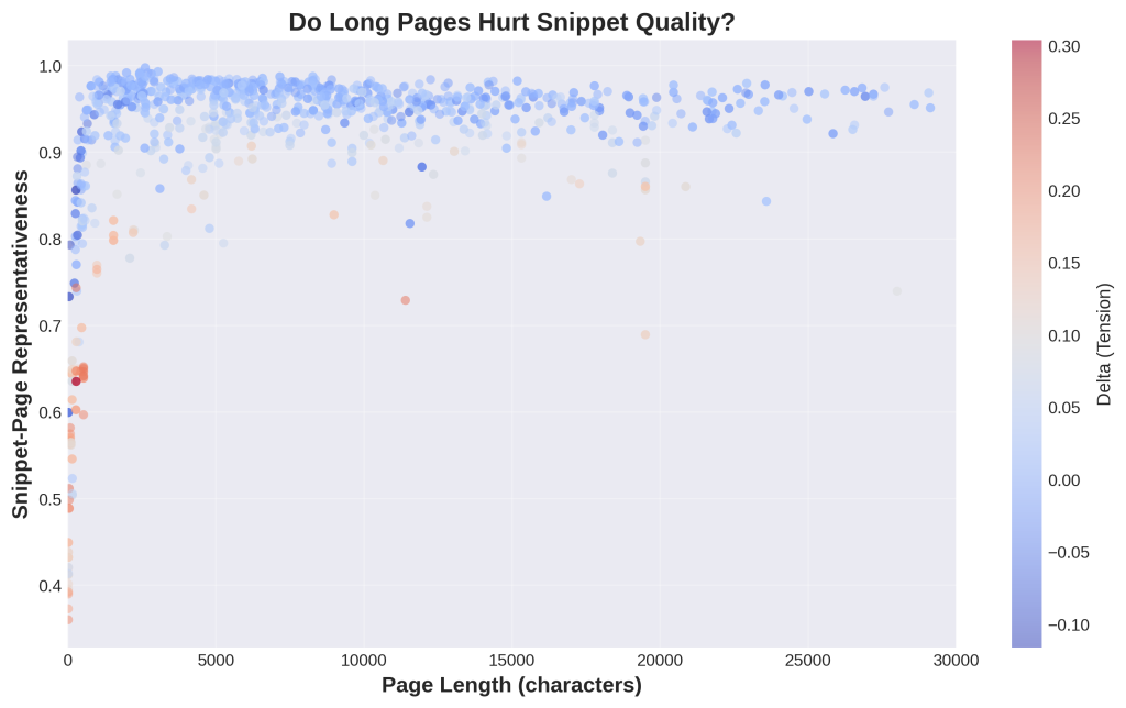
1. What is this
This scatter plot shows page length on the x-axis (in characters) and snippet representativeness on the y-axis. Each dot represents one snippet-page pair. Colors show semantic tension (red/pink means page performed better, blue means snippet performed better). If long pages hurt extraction, you’d see representativeness decline as you move right. Instead, dots maintain high values across all page lengths.
2. How it was generated
Data: 1,394 snippet-page pairs with length information.
Process:
- X-axis: Each snippet’s source page length in characters
- Y-axis: That snippet’s representativeness score (how well it captures the page)
- Colors: Delta (semantic tension) – whether the snippet or page was more relevant to the query
- We capped the x-axis at 30,000 characters for visual clarity
- No trend line because there’s no significant correlation (r = -0.07)
3. What do I do with this information
Good news: Page length doesn’t hurt snippet extraction quality.
What the data shows:
- Short pages (1,000 chars): produce good snippets
- Medium pages (5,000 chars): produce good snippets
- Long pages (20,000+ chars): still produce good snippets
- No quality degradation as length increases
Why this matters:
- Long-form content is safe: If you prefer writing comprehensive 5,000+ word guides, extraction still works well
- Concise content also works: Shorter 1,500-word articles extract just as well
- The extraction algorithm is sophisticated: Google handles both short and long sources effectively
What DOES matter (since length doesn’t):
- Topic coherence: Don’t mix unrelated topics regardless of length
- Clear sections: Use H2/H3 structure so extraction finds boundaries
- Front-loading: Put key information early, though long pages still work
Action: Stop worrying about page length as a factor in AI visibility. A well-structured 6,000-word article will produce better snippets than a poorly-structured 2,000-word article. Focus on structure and coherence, not hitting or avoiding certain word counts.
Chart 12: Snippet vs Page – Direct Comparison
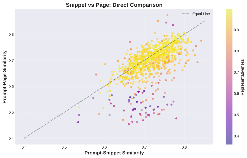
1. What is this
This scatter plot directly compares each snippet to its full page. The x-axis shows snippet quality (similarity to query), the y-axis shows page quality (similarity to query). Each dot is one snippet-page pair. The black diagonal line means “equal” – dots below the line mean snippets are better, dots above mean pages are better. Colors show representativeness (yellow = high). Most dots fall below the line.
2. How it was generated
Data: 1,394 snippet-page pairs.
Process:
- For each snippet, we calculated its similarity to the query using embeddings (x-axis)
- We calculated its source page’s similarity to the same query (y-axis)
- We colored each dot by snippet-page representativeness
- We added the diagonal equality line for visual reference
- Both axes use the same 0-1 cosine similarity scale
3. What do I do with this information
This validates the semantic tension concept.
Most dots below the line: Snippets outperform their source pages 67.6% of the time.
What this means:
- Extraction ADDS VALUE by focusing content
- Google successfully identifies and isolates the most relevant portions
- Gemini gets better input from snippets than from full pages
- Your snippet quality (x-axis position) determines AI citations
The color pattern matters:
- Yellow dots below the line = IDEAL: Snippet wins AND accurately represents the page
- Purple dots below the line = RISKY: Snippet wins but doesn’t represent page well (cherry-picking)
- Yellow dots above the line: Page wins, but snippet still captures the essence
Why this matters:
- Gemini sees the snippet, not the full page
- Your x-axis position (snippet quality) drives AI visibility
- Pages that produce dots above the line are losing potential AI citations
Action:
- Identify dots that fall above the line (pages winning)
- Ask: “Why isn’t my snippet as good as my full page?”
- Usually means: best content is scattered throughout the page or buried
- Solution: Restructure so the most relevant content is in a clear, extractable section near the top or with clear H2 markers
Chart 13: Performance Delta by Rank Position
1. What is this
These box plots show semantic tension (snippet quality minus page quality) across rank positions 1-10. Each green box represents one rank. The y-axis shows delta values – positive means snippets outperform pages, negative means pages outperform snippets. The red dashed line at zero represents equal performance. All boxes hover around or above zero, showing snippets consistently win across all ranks.
2. How it was generated
Data: 1,394 snippets grouped by rank position.
Process:
- For each rank position (1 through 10), we collected all delta values
- Delta = (snippet-query similarity) – (page-query similarity)
- We calculated the distribution of deltas for each rank
- We plotted as box plots showing median, quartiles, and outliers
- The box shows the middle 50% of values, circles are outliers, diamonds are means
3. What do I do with this information
Key finding: Snippets outperform pages consistently across ALL rank positions, not just the top ones.
What this tells you:
- Even rank 8-10 snippets beat their source pages
- Google’s extraction quality doesn’t degrade at lower ranks
- Gemini receives high-quality focused content regardless of rank position
Why this matters for SEO:
- Every page-one position contributes quality snippets to AI
- Lower ranks (positions 5-10) are viable AI visibility targets
- You don’t need position 1 to get your content into AI answers
- Multi-source synthesis works because all sources maintain quality
Strategic implication:
- Target long-tail queries where you can rank anywhere on page one
- Build topical authority across multiple page-one rankings
- Don’t abandon a keyword just because you’re position 7
- The AI considers all page-one results when synthesizing answers
Action:
- Review keywords where you rank positions 5-10
- These are now valuable AI visibility opportunities (not “losses”)
- Create complementary content to build page-one presence on related queries
- Stop fighting for position 1 if you can secure multiple page-one positions on related terms
Chart 14: Quality Quadrants – Where Do Your Snippets Fall?
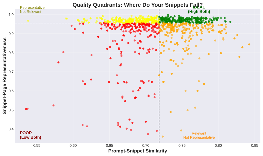
1. What is this
This scatter plot divides snippets into four quality categories using median values as dividers. The x-axis shows snippet relevance to the query, the y-axis shows snippet representativeness of the page. Black dashed lines mark the medians. Green dots (top-right) are ideal – high relevance and high representativeness. Orange dots (bottom-right) are relevant but not representative. Yellow dots (top-left) are representative but not relevant. Red dots (bottom-left) are poor on both metrics.
2. How it was generated
Data: 1,394 individual snippets.
Process:
- X-axis: Snippet-query similarity for each snippet
- Y-axis: Snippet-page representativeness for each snippet
- We calculated the median value for both metrics
- We drew lines at the medians to create four quadrants
- We colored dots based on which quadrant they fall into
- Green = both high, orange = relevant only, yellow = representative only, red = both low
3. What do I do with this information
This is your diagnostic tool for content quality.
GREEN quadrant (top-right) – IDEAL:
- High relevance to the query
- High fidelity to the source page
- These snippets drive AI citations
- This is where you want to be
ORANGE quadrant (bottom-right) – Relevant but not representative:
- Snippet matches the query well
- But doesn’t reflect the full page accurately
- Risky: AI might cite you but misrepresent your content
- Usually caused by: multi-topic pages or cherry-picked snippets
YELLOW quadrant (top-left) – Representative but not relevant:
- Snippet accurately reflects the page
- But the page isn’t that relevant to the query
- Means: extraction worked fine, but you’re targeting the wrong keywords
- Usually caused by: general content or poor keyword targeting
RED quadrant (bottom-left) – POOR:
- Low relevance AND low representativeness
- Fundamental mismatch or extraction failure
- These are your problem cases requiring immediate attention
Action:
- Count your dots in each quadrant – calculate what % are green
- Target: 75%+ in the green quadrant
- For orange cases: Review pages for multiple topics, split them up
- For yellow cases: Improve keyword targeting or make content more specific
- For red cases: Complete audit needed – fundamental issues with content or targeting
Chart 15: Distribution of Snippet Ranks Used
1. What is this
This bar chart shows how frequently each rank position (1 through 10) appears in the dataset. The x-axis lists rank positions, the y-axis shows the count of snippets at each position. You can see that positions 1, 3, 4, 5, 8, and 10 are most common, with some variation. This represents Google’s snippet selection patterns across all queries.
2. How it was generated
Data: 1,394 snippets with rank position labels.
Process:
- For each snippet in the dataset, we recorded which rank position it came from
- We counted how many snippets came from each rank (1-10)
- We plotted these counts as bars
- This is simple frequency counting – no calculations needed
- Limited to ranks 1-10 for clarity
3. What do I do with this information
This reveals Google’s snippet selection patterns.
What the distribution shows:
- Google doesn’t always use all 10 results
- Some positions appear more frequently (1, 3, 4, 5, 8, 10)
- Selection is dynamic based on query needs
- Multiple sources are standard practice
Why this matters:
- Not every page-one ranking automatically becomes a snippet
- Google curates which results to extract from
- Just ranking isn’t enough – quality signals matter after ranking
- Multiple sources contribute but selection is quality-based
What affects snippet selection probability after you rank:
- Content structure: Clear H2/H3 sections help
- Query alignment: Focused topic match improves odds
- E-E-A-T signals: Authority and expertise markers
- Technical SEO: Proper markup and structured data
- Extractability: Content that can stand alone as a snippet
Action:
- Don’t assume every page-one ranking becomes an AI source
- Optimize ranked pages for snippet extraction quality
- Use schema markup and clear structure to signal snippet-worthiness
- Add H2/H3 headings that directly answer potential queries
- Monitor which of your ranked pages actually appear in AI answers (track citation rates)
Leave a Reply